
MindFusion has released a new version of its charting component for WinForms. Here is an overview of the new features:
Mouse Dragging in Pies
You can click on the border between any two pieces in a pie chart and drag it to change the values of those pieces. The sum of the values for the two pieces stays the same.
Support for Undefined Values
If your data contains null, double.NaN or other data that is not defined you have three ways to handle it – ignore it, replace it with 0 or with the average of the two neighbouring values. Use the HandleEmptyValue property to choose how undefined values are handled.
ToolTips
All chart types support tool tips. Area charts can show a different tooltip for the region between each two values.
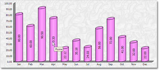
Tool tips in a 3D cylinder chart.
Themes
Chart themes are represented by XML files that can be saved and loaded with the SaveTheme and LoadTheme methods. At your disposal is a special theme editor tool that helps you create, edit and save themes fast and easy.
Major and Minor Axis Ticks
Axis ticks are drawn more precisely now – you can draw major and minor ticks. The count of minor ticks is customizable. You can set the pen and length of both ticks. Ticks are supported for all chart axes.
Miscellaneous
Hit testing has been greatly improved. All chart types support the DataIndex and SeriesIndex properties, which let you know the exact location of the hittMindFusion has released a new version of its charting component for WinForms. Here is an overview of the new features:
Mouse Dragging in Pies
You can click on the border between any two pieces in a pie chart and drag it to change the values of those pieces. The sum of the two piece values stays the same.
Support for Undefined Values
If your data contains null, double.NaN or other data that is not defined you have three ways to handle it – ignore it, replace it with 0 or with the average of the two neighbouring values. Use the HandleEmptyValue property to choose how undefined values are handled.
ToolTips
All chart types support tool tips. Area charts can show a different tooltip for the region between each two values.
Themes
Chart themes are represented by XML files that can be saved and loaded with the SaveTheme and LoadTheme methods. At your disposal is a special theme editor tool that helps you create, edit and save themes fast and easy.
Major and Minor Axis Ticks
Axis ticks are drawn more precisely now – you can draw major and minor ticks. The count of minor ticks is customizable. You can set the pen and length of both ticks. Ticks are supported for all chart axes.
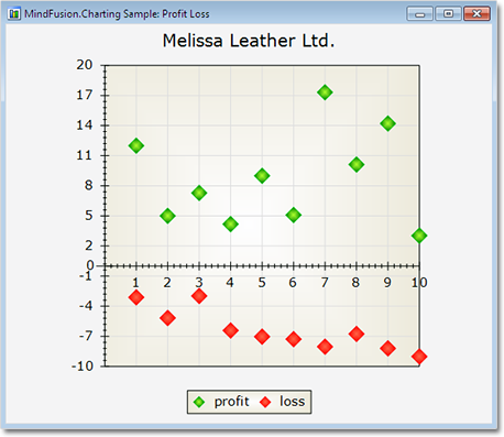
Major and minor axis ticks in a scatter chart.
Miscellaneous
Hit testing has been greatly improved. All chart types support the DataIndex and SeriesIndex properties, which let you know the exact location of the hi value in the arrays with data values for the chart. There are also other new and improved features regarding the hit testing of a chart.
Some changes were necessary to keep the API simple and elegant – we have renamed several existing properties – please check the documentation.
Read more about the new features at the Charting for WinForms forum.
The trial version is available for direct download from this link:
Download MindFusion.Charting for WinForms 3.5
Technical support is available at the forum, help desk or at e-mail support@mindfusion.dev. All inquiries are answered within hours of being received.
About MindFusion.Charting for WinForms: a professional programming component for WinForms, which lets you create remarkable charts fast and easy. The tool supports all major chart types – line, pie, radar and bar – and numerous variations of them – column, area, bubble, polar, doughnut etc. 3D charts are supported as well.
Charting for WinForms supports a rich user interaction model with features like zoom, hit testing, drill down, mouse dragging and more. You can use delegates to present mathematical functions, undefined values are also acceptable. Values can be data arrays or retrieved through a database.
The appearance of each chart is fully customizable. The control offers strong design-time support with custom collection editors and chart wizards. At your disposal is a set of predefined appearance themes and a theme editor tool. A full list of the features can be read here.


