
Creating a custom user interface often requires tailoring components to fit your application’s specific design language. In this guide, we’ll walk you through how to build and style a WPF virtual keyboard from the ground up, using the powerful MindFusion’s WPF Virtual Keyboard component. The result will be a beautiful, resizable keyboard with custom icons, animations, and a clean, maintainable structure.
Step 1: Project Setup & NuGet Packages
First, create a new WPF Application project in Visual Studio. Once your project is ready, you’ll need to add the virtual keyboard component. You can do this easily via the NuGet Package Manager.
Search for and install the following package:
MindFusion.Keyboard.Wpf (version 5.1.0)
This will add all the necessary assemblies to your project.
Step 2: Defining the Keyboard Layout
The structure of the keyboard—what keys are present and where they are located—is defined in a simple XML file. This approach cleanly separates the keyboard’s layout from its visual styling.
Create an XML file in your project named device.xml. Here’s a snippet showing how to define a few keys:
<?xml version="1.0"?>
<KeyboardLayout xmlns:xsd="http://www.w3.org/2001/XMLSchema" xmlns:xsi="http://www.w3.org/2001/XMLSchema-instance">
  <Keys>
    <!-- A special key, like Enter or Shift -->
    <Key xsi:type="SpecialKey">
      <Content xsi:type="xsd:string">Enter</Content>
      <Left>555</Left>
      <Top>102</Top>
      <Width>105</Width>
      <Height>40</Height>
      <VirtualKey>13</VirtualKey>
    </Key>

    <!-- A regular character key -->
    <Key xsi:type="RegularKey">
      <Left>105</Left>
      <Top>101</Top>
      <Width>40</Width>
      <Height>40</Height>
      <VirtualKey>65</VirtualKey> <!-- 'A' key -->
    </Key>
  </Keys>
  <Width>675</Width>
  <Height>250</Height>
</KeyboardLayout>
Each key is defined with its position, size, and most importantly, its VirtualKey code. This numeric code is what the operating system uses to identify the key, and we’ll use it later for styling.
You can create the XML template for the keyboard fast and easy using online UI keyboard editor: the Virtual Keyboard Creator.
Step 3: Adding and Initializing the Keyboard
With the layout defined, let’s add the keyboard to our main window.
In ‘MainWindow.xaml’:
We’ll create a simple Grid layout with two rows: one for the keyboard and one for a TextBox to see our output.
<Window x:Class="KeyboardTest.MainWindow"
        xmlns="http://schemas.microsoft.com/winfx/2006/xaml/presentation"
        xmlns:x="http://schemas.microsoft.com/winfx/2006/xaml"
        xmlns:vk="http://mindfusion.eu/keyboard/wpf"
        mc:Ignorable="d"
        Title="MainWindow" Height="500" Width="1150">
    <Window.Resources>
        <ResourceDictionary>
            <ResourceDictionary.MergedDictionaries>
                <ResourceDictionary Source="MedicalVKStyle.xaml"/>
            </ResourceDictionary.MergedDictionaries>
        </ResourceDictionary>
    </Window.Resources>

    <Grid>
        <Grid.RowDefinitions>
            <RowDefinition Height="*"/>
            <RowDefinition Height="Auto"/>
        </Grid.RowDefinitions>

        <Border Grid.Row="0" Background="#D0E9F2" BorderThickness="5" BorderBrush="#20788C">
            <vk:VirtualKeyboard x:Name="vk" Margin="0 0 0 0" />
        </Border>

        <TextBox Grid.Row="1" x:Name="outputTextBox" Margin="10" MinHeight="50" AcceptsReturn="True" VerticalScrollBarVisibility="Auto"/>
    </Grid>
</Window>
Notice we’ve also added a “ResourceDictionary” that points to “MedicalVKStyle.xaml”—this is where we’ll put all our styling.
In “MainWindow.xaml.cs”:
In the code-behind, we initialize the keyboard, load our “device.xml” layout, and link the keyboard’s output to our “TextBox”.
public partial class MainWindow : Window
{
    public MainWindow()
    {
        InitializeComponent();

        vk.IsStandAlone = false;
        vk.TemplateLayout = KeyboardLayout.Create("device.xml");
        vk.Background = Brushes.SkyBlue;
        vk.LayoutRing.Add(KeyboardLayout.Create("device.xml"));
        vk.ApplyTemplate();

        // Link the keyboard to the TextBox
        vk.InputTarget = outputTextBox;
    }
}
Step 4: Creating a Custom Style in XAML
This is where the styling happens. We create a new “ResourceDictionary” file named “MedicalVKStyle.xaml” to define the keyboard’s look and feel. This approach keeps our styles neatly organized and separate from the main window’s layout.
The Base Style for All Keys
To avoid repeating code, we define a single base style that all keys will use. This BaseKeyStyle defines the background gradient, border, drop shadow, and interactive animations (like changing color on mouse-over or click).
<!-- Base Style for all keys -->
<Style x:Key="BaseKeyStyle" TargetType="{x:Type ContentControl}">
    <Setter Property="Template">
        <Setter.Value>
            <ControlTemplate TargetType="{x:Type ContentControl}">
                <!-- ... Storyboards for animations ... -->
                <Grid>
                    <Rectangle x:Name="rectangle" RadiusY="3" RadiusX="3">
                        <Rectangle.Effect>
                            <DropShadowEffect ShadowDepth="1" BlurRadius="2" Direction="267"/>
                        </Rectangle.Effect>
                        <Rectangle.Fill>
                            <LinearGradientBrush EndPoint="0.5,1" StartPoint="0.5,0">
                                <GradientStop Color="#FF20788C" Offset="0"/>
                                <GradientStop Color="#FF2aa1bb" Offset="1"/>
                            </LinearGradientBrush>
                        </Rectangle.Fill>
                    </Rectangle>
                    <ContentPresenter HorizontalAlignment="Center" VerticalAlignment="Center"/>
                </Grid>
                <!-- ... ControlTemplate.Triggers for events ... -->
            </ControlTemplate>
        </Setter.Value>
    </Setter>
</Style>

<!-- Implicitly apply this style to all ContentControls -->
<Style TargetType="{x:Type ContentControl}" BasedOn="{StaticResource BaseKeyStyle}"/>
Styling Special Keys with DataTriggers
For special keys like ‘Shift’, ‘Enter’, and ‘Backspace’, we want to display custom icons instead of text. We achieve this declaratively in XAML using “DataTrigger”s.
First, we define simple “DataTemplate”s that contain only the icon “Path” data.
<!-- DataTemplate for the Backspace icon -->
<DataTemplate x:Key="key_BACKSPACE">
    <Grid>
        <Path Fill="#FFD0E9F2" Stretch="None" Stroke="#FF20788C"
              Data="M21,11H6.83l3.58-3.59L9,6l-6,6,6,6,1.41-1.41L6.83,13H21V11Z"
              HorizontalAlignment="Center" VerticalAlignment="Center"/>
    </Grid>
</DataTemplate>
Then, in the “DataTemplate” for “vk:SpecialKey”, we create a “Style” that switches the “ContentTemplate” based on the key’s “VirtualKey” code.
<DataTemplate DataType="{x:Type vk:SpecialKey}">
    <ContentControl Content="{Binding .}" VerticalContentAlignment="Center" HorizontalContentAlignment="Center">
        <ContentControl.Style>
            <Style TargetType="ContentControl" BasedOn="{StaticResource BaseKeyStyle}">
                <Setter Property="ContentTemplate" Value="{StaticResource key_Def}"/>
                <Style.Triggers>
                    <!-- When VirtualKey is 16 (Shift), use the Shift icon template -->
                    <DataTrigger Binding="{Binding VirtualKey}" Value="16">
                        <Setter Property="ContentTemplate" Value="{StaticResource key_SHIFT}"/>
                    </DataTrigger>
                    <!-- When VirtualKey is 8 (Backspace), use the Backspace icon template -->
                    <DataTrigger Binding="{Binding VirtualKey}" Value="8">
                        <Setter Property="ContentTemplate" Value="{StaticResource key_BACKSPACE}"/>
                    </DataTrigger>
                    <!-- ... Other triggers for Enter, Tab, etc. ... -->
                </Style.Triggers>
            </Style>
        </ContentControl.Style>
    </ContentControl>
</DataTemplate>
In Addition: Applying the Predefined Virtual Keyboard Styles
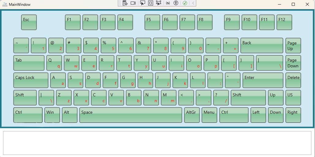
The Virtual Keyboard component itself comes with 10+ predefined styles. There’s plenty to choose from, so you might want to utilize what is already available. Here’s how it’s done:
- Comment the code that loads the custom template file (MedicalVKStyle.xaml) in MainWindow.xaml:
...................
 xmlns:local="clr-namespace:KeyboardTest"
    mc:Ignorable="d"
    Title="MainWindow" Height="500" Width="1150">
<!--<Window.Resources>
    <ResourceDictionary>
        <ResourceDictionary.MergedDictionaries>
            <ResourceDictionary Source="MedicalVKStyle.xaml"></ResourceDictionary>
        </ResourceDictionary.MergedDictionaries>
    </ResourceDictionary>
</Window.Resources>-->

<Grid>
    <Grid.RowDefinitions>
................
2. Import the namespace “MindFusion.UI.Wpf;”, which is part of the Virtual Keyboard NuGet package. In the constructor, specify the desired colour scheme this way:
using MindFusion.UI.Wpf;
...........

 {
     InitializeComponent();

     ColorScheme.Scheme = Scheme.OfficeGreen;
}
Note that you do not need to apply the theme on the VirtualKeyboard instance directly.
Now, when you run the sample, instead of the custom-styled medical keyboard, the Office-Green styled keyboard is loaded:
Download the sample: complete source code and links to the NuGet package
Conclusion
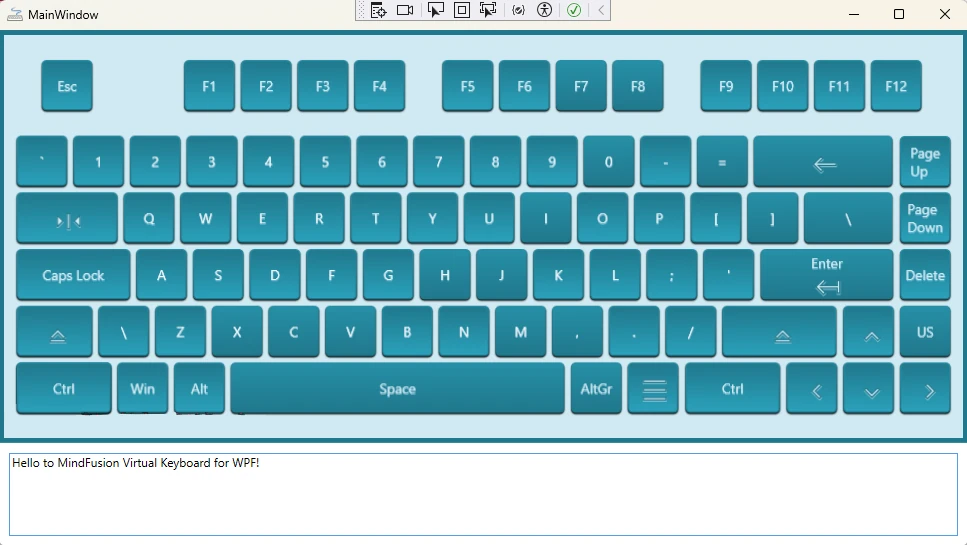
And there you have it! By combining an XML layout file with a powerful and reusable XAML styling system, we’ve created a fully custom and visually appealing WPF virtual keyboard. This approach keeps the design clean, maintainable, and easy to update, separating the keyboard’s structure from its appearance and behavior.
About MindFusion Virtual Keyboard for WPF: The MindFusion Virtual Keyboard for WPF is a powerful and highly customizable on-screen input solution, perfect for touch-enabled applications in specialized environments. As demonstrated in this guide for creating a custom medical keyboard, its flexible design empowers developers to create bespoke layouts tailored to unique industry demands,ensuring secure and intuitive data entry. Integrate it seamlessly into your WPF applications to provide a robust and adaptable user experience.