Create diagram connectors using drag and drop

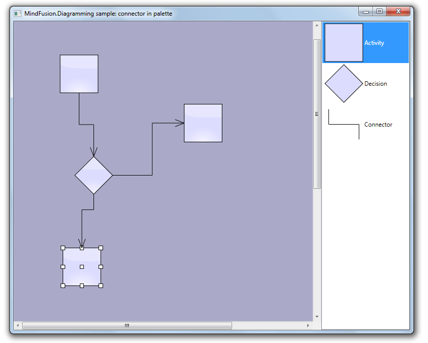
In this post we show how to create diagram links via drag-and-drop operation from a NodeListView used as a palette. Since the NodeListView control can contain only DiagramNode objects, we will create a custom node shape representing a connector. Once the dummy connector node is created, the NodeCreated event handler will replace it with a DiagramLink. In addition, the handler will find nearby nodes and automatically connect the link to them.

Let’s start with a new WPF project. Add a reference to mindfusion.diagramming.dll, and add Diagram and NodeListView controls to the window:

<ScrollViewer
	Grid.Column="0"
	Focusable="False"
	HorizontalScrollBarVisibility="Visible">
	
	<diag:Diagram
		x:Name="diagram"
		AllowDrop="True"
		NodeCreated="OnNodeCreated"
		NodeModified="OnNodeModified">
	</diag:Diagram>
	
</ScrollViewer>

<diag:NodeListView
	x:Name="nodeList"
	Grid.Column="1">
</diag:NodeListView>

In the Window constructor, create a custom node shape that will represent connectors:

var connectorShape = new Shape(
	null, // no borders
	new[] // decorations
	{
		new LineTemplate(10, 10, 10, 50),
		new LineTemplate(10, 50, 90, 50),
		new LineTemplate(90, 50, 90, 90)
	},
	null,
	FillRule.Nonzero, "Connector");

Add a few nodes to the NodeListView, along with the dummy connector node:

var item1 = new ShapeNode { Shape = Shapes.Rectangle };
NodeListView.SetLabel(item1, "Activity");
nodeList.Items.Add(item1);

var item2 = new ShapeNode { Shape = Shapes.Decision };
NodeListView.SetLabel(item2, "Decision");
nodeList.Items.Add(item2);

var item3 = new ShapeNode { Shape = connectorShape };
NodeListView.SetLabel(item3, "Connector");
nodeList.Items.Add(item3);

In the NodeCreated event handler, check if the newly created node represents a connector, and replace it with a DiagramLink:

var node = e.Node as ShapeNode;
if (node != null)
{
	if (node.Shape.Id == "Connector")
	{
		// replace the dummy connector node with a DiagramLink
		var bounds = node.Bounds;
		diagram.Items.Remove(node);

		var link = diagram.Factory.CreateDiagramLink(
			bounds.TopLeft, bounds.BottomRight);
		link.SegmentCount = 3;
		link.Shape = LinkShape.Cascading;

		ConnectToNearbyNode(link);
	}
	...
}

Otherwise if it is a regular node, set its anchor points and connect it to nearby unconnected links, if there are any:

else
{
	node.AnchorPattern = AnchorPattern.Decision2In2Out;
	node.Effects.Add(new GlassEffect());
	ConnectToNearbyLink(node);
}

The ConnectToNearbyNode method uses a LINQ query to find nodes in the vicinity of the link’s start or end point. If one is found at a distance shorter than 120 points, it is set as the link’s Origin or Destination.

private void ConnectToNearbyNode(DiagramLink link)
{
	// connect to a nearby origin node
	var origin = diagram.Nodes.OrderBy(n =>
		Utilities.Distance(n.GetCenter(), link.StartPoint)).FirstOrDefault();

	if (origin != null)
	{
		var distance = Utilities.Distance(origin.GetCenter(), link.StartPoint);
		if (distance < 120)
		{
			link.Origin = origin;
			link.Route();
		}
	}

	// connect to a nearby destination node
	var destination = diagram.Nodes.Where(n => n != origin).OrderBy(n =>
		Utilities.Distance(n.GetCenter(), link.EndPoint)).FirstOrDefault();

	if (destination != null)
	{
		var distance = Utilities.Distance(destination.GetCenter(), link.EndPoint);
		if (distance < 120)
		{
			link.Destination = destination;
			link.Route();
		}
	}
}

Similarly, the ConnectToNearbyLink method finds a nearby unconnected link and sets the specified node as the link’s Origin or Destination.

private void ConnectToNearbyLink(DiagramNode node)
{
	var outLink = diagram.Links.Where(l => l.Origin is DummyNode).OrderBy(l =>
		Utilities.Distance(node.GetCenter(), l.StartPoint)).FirstOrDefault();

	if (outLink != null)
	{
		var distance = Utilities.Distance(node.GetCenter(), outLink.StartPoint);
		if (distance < 90)
		{
			outLink.Origin = node;
			outLink.Route();
			return;
		}
	}

	var inLink = diagram.Links.Where(l => l.Destination is DummyNode).OrderBy(l =>
		Utilities.Distance(node.GetCenter(), l.EndPoint)).FirstOrDefault();

	if (inLink != null)
	{
		var distance = Utilities.Distance(node.GetCenter(), inLink.EndPoint);
		if (distance < 90)
		{
			inLink.Destination = node;
			inLink.Route();
			return;
		}
	}
}

The result of several drag and drop operation is displayed below.

The complete sample project is available for download here:
https://mindfusion.dev/_samples/LinkDragDrop.zip

Enjoy!

Charting for WinForms 3.5

MindFusion has released a new version of its charting component for WinForms. Here is an overview of the new features:

Mouse Dragging in Pies
You can click on the border between any two pieces in a pie chart and drag it to change the values of those pieces. The sum of the values for the two pieces stays the same.

Support for Undefined Values
If your data contains null, double.NaN or other data that is not defined you have three ways to handle it – ignore it, replace it with 0 or with the average of the two neighbouring values. Use the HandleEmptyValue property to choose how undefined values are handled.

ToolTips
All chart types support tool tips. Area charts can show a different tooltip for the region between each two values.

Tool tips in a 3D cylinder chart.

Tool tips in a 3D cylinder chart.

Themes
Chart themes are represented by XML files that can be saved and loaded with the SaveTheme and LoadTheme methods. At your disposal is a special theme editor tool that helps you create, edit and save themes fast and easy.

Major and Minor Axis Ticks
Axis ticks are drawn more precisely now – you can draw major and minor ticks. The count of minor ticks is customizable. You can set the pen and length of both ticks. Ticks are supported for all chart axes.

Miscellaneous
Hit testing has been greatly improved. All chart types support the DataIndex and SeriesIndex properties, which let you know the exact location of the hittMindFusion has released a new version of its charting component for WinForms. Here is an overview of the new features:

Mouse Dragging in Pies
You can click on the border between any two pieces in a pie chart and drag it to change the values of those pieces. The sum of the two piece values stays the same.

Support for Undefined Values
If your data contains null, double.NaN or other data that is not defined you have three ways to handle it – ignore it, replace it with 0 or with the average of the two neighbouring values. Use the HandleEmptyValue property to choose how undefined values are handled.

ToolTips
All chart types support tool tips. Area charts can show a different tooltip for the region between each two values.

Themes
Chart themes are represented by XML files that can be saved and loaded with the SaveTheme and LoadTheme methods. At your disposal is a special theme editor tool that helps you create, edit and save themes fast and easy.

Major and Minor Axis Ticks
Axis ticks are drawn more precisely now – you can draw major and minor ticks. The count of minor ticks is customizable. You can set the pen and length of both ticks. Ticks are supported for all chart axes.

Major and minor axis ticks in a scatter chart.

Major and minor axis ticks in a scatter chart.

Miscellaneous
Hit testing has been greatly improved. All chart types support the DataIndex and SeriesIndex properties, which let you know the exact location of the hi value in the arrays with data values for the chart. There are also other new and improved features regarding the hit testing of a chart.

Some changes were necessary to keep the API simple and elegant – we have renamed several existing properties – please check the documentation.

Read more about the new features at the Charting for WinForms forum.

The trial version is available for direct download from this link:

Download MindFusion.Charting for WinForms 3.5

Technical support is available at the forum, help desk or at e-mail support@mindfusion.dev. All inquiries are answered within hours of being received.

About MindFusion.Charting for WinForms: a professional programming component for WinForms, which lets you create remarkable charts fast and easy. The tool supports all major chart types – line, pie, radar and bar – and numerous variations of them – column, area, bubble, polar, doughnut etc. 3D charts are supported as well.

Charting for WinForms supports a rich user interaction model with features like zoom, hit testing, drill down, mouse dragging and more. You can use delegates to present mathematical functions, undefined values are also acceptable. Values can be data arrays or retrieved through a database.

The appearance of each chart is fully customizable. The control offers strong design-time support with custom collection editors and chart wizards. At your disposal is a set of predefined appearance themes and a theme editor tool. A full list of the features can be read here.

Custom appearance of WPF Resource view

Continuing from the previous post we will now customize the appearance of the Resource view to achieve a more aesthetically pleasing presentation. The appearance of the view is customized by setting various properties of the Calendar.ResourceViewSettings object.

We will build our presentation on the Silver theme by reducing the sharpness and contrast of colors and making the font uniform across the entire view. The customization process is divided to the following steps:

Customize the view background.

calendar.ResourceViewSettings.CalendarStyle.Background = Brushes.White;

Customize the row headers.

calendar.ResourceViewSettings.ExpandableRows = false;
calendar.ResourceViewSettings.HeaderStyle.FontFamily = headerFont;
calendar.ResourceViewSettings.HeaderStyle.FontSize = 13;
calendar.ResourceViewSettings.HeaderStyle.Foreground = new SolidColorBrush(Color.FromArgb(255, 64, 64, 64));
calendar.ResourceViewSettings.HeaderStyle.Background = Brushes.White;
calendar.ResourceViewSettings.HeaderStyle.BorderBrush = borderBrush;
calendar.ResourceViewSettings.HeaderStyle.BorderThickness = new Thickness(0, 0, 0, 1);

Customize the view cells.

calendar.ResourceViewSettings.CellStyle.Background = Brushes.White;
calendar.ResourceViewSettings.CellStyle.BorderBrush = borderBrush;
calendar.ResourceViewSettings.WeekendStyle.Background = new SolidColorBrush(Color.FromArgb(255, 250, 250, 250));
calendar.ResourceViewSettings.WeekendStyle.BorderBrush = borderBrush;

Customize the view timelines.

calendar.ResourceViewSettings.BottomTimelineSettings.CalendarStyle.Background = Brushes.White;
calendar.ResourceViewSettings.BottomTimelineSettings.CalendarStyle.BorderBrush = borderBrush;
calendar.ResourceViewSettings.BottomTimelineSettings.CalendarStyle.FontFamily = headerFont;
calendar.ResourceViewSettings.BottomTimelineSettings.CalendarStyle.FontSize = 13;
calendar.ResourceViewSettings.BottomTimelineSettings.CalendarStyle.FontWeight = FontWeights.Normal;
calendar.ResourceViewSettings.BottomTimelineSettings.NowFillBrush = Brushes.Transparent;
calendar.ResourceViewSettings.MiddleTimelineSettings.CalendarStyle.Background = Brushes.White;
calendar.ResourceViewSettings.MiddleTimelineSettings.CalendarStyle.BorderBrush = borderBrush;
calendar.ResourceViewSettings.MiddleTimelineSettings.CalendarStyle.FontFamily = headerFont;
calendar.ResourceViewSettings.MiddleTimelineSettings.CalendarStyle.FontSize = 13;
calendar.ResourceViewSettings.MiddleTimelineSettings.CalendarStyle.FontWeight = FontWeights.Normal;
calendar.ResourceViewSettings.MiddleTimelineSettings.NowFillBrush = Brushes.Transparent;

Note that the font, headerFont and borderBrush variables are defined as follows:

FontFamily font = new FontFamily("Segoe UI");
FontFamily headerFont = new FontFamily("Segoe UI Light");
Brush borderBrush = new SolidColorBrush(Color.FromArgb(255, 224, 224, 224));

The final result is displayed below.

scheduling-resourceviewappearance

The complete sample project is available for download here:
https://mindfusion.dev/_samples/WpfPlannerResourceViewAppearance.zip

You can get the trial version of MindFusion.Scheduling for WPF from this link:
https://mindfusion.dev/WpfPlannerTrial.zip

Enjoy!

Diagramming for ASP.NET 5.0.2

MindFusion has released a new version of its diagramming component for ASP.NET. Here is a list of the most important new features:

Canvas Mode Improvements

  • Glass and Aero effects
  • radial gradients
  • multiple labels per link
  • NodeSelectedScript and LinkSelectedScript client-side events
  • more new methods and events
Node visual effects.

Node visual effects.

ContainerNode Improvements

  • Child nodes are now drawn by their containers; when containers overlap, the children of a lower container cannot appear in front of the upper container anymore
  • the ClipChildren property specifies whether to clip child items to container’s boundaries
  • the ZIndex property no longer changes automatically when dropping nodes into a container
  • and more
Container nodes.

Container nodes.

Improvements in the PdfExporter

  • improved handling of clip regions in custom drawing code
  • PdfExporter now honors the target Rectangle property of linear gradients
  • PDF shadings now include all colors from a ColorBlend
  • more precise character widths set when text includes both eastern glyphs and Latin characters
  • as well other improvements

Detailed information about the release is posted at the forum. If you are interested in the component, use the following link to get the trial version:

Download MindFusion.Diagramming for ASP.NET 5.0.2 Trial Version

Technical support

MindFusion support team is happy to assist you with any questions you might have about Diagramming for ASP.NET or any other of our products. You can leave a message at the discussion board, use the help desk or e-mail support@mindfusion.dev.. We strive to provide competent and detailed answers to your questions within hours of receiving them.

About Diagramming for ASP.NET: An advanced WebForms programming component that offers all the functionality that is needed for creating, styling and presenting attractive flowcharts, hierarchies, trees, graphs, schemes, diagrams and many more. The control offers numerous utility methods, path finding and cycle detection, rich event set and many useful user interaction features like tool tips, multiple selection, copy/paste to/from Windows clipboard and many more.

NetDiagram offers 87 predefined node shapes, scrollable tables, 13 automatic layouts and many more. You can check the online demo to see some of the features in action. The control includes many samples, detailed documentation and step-by-step tutorials. Every features is duly documented and there’s plenty of code to copy. We have done our best to make the component not only powerful and scalable, but easy to learn and fun to use.

Line Chart with a Separator in WinForms

In today’s post we’ll show how to build a line chart with several line series and a separator line. The separator line is drawn at a given height and divides the chart into two halves.

The Line Series

The line series are three, so we must add three lists with data to the XData and YData properties. We can do this in three ways: type the values in design time, write them in code or use data binding. In design time we use the built-in collection editors of the control:

The Series collection editor

The Series collection editor

In code we make lists with the data and add them to XData or YData:

lineChart1.YData.Clear();
lineChart1.YData.Add(new List { 45, 64, 38.2, 33.03, 56, 68, 39, 42 });
lineChart1.YData.Add(new List { 34, 42, 28, 42, 35, 31, 62, 55 });
lineChart1.YData.Add(new List { 22, 19, 32, 28, 17, 25, 31, 36 });

If you want to use data binding then set DataSource to the name of the data source, DataMember to specify the name of the table which will supply the data and XDataFields/YDataFields to provide the name(s) of the fields. In this case we will require three data base columns for each of the three series – separate the names with a comma e.g.

lineChart1.YDataFields = "Sales1,Sales2,Sales3";

For XData we use the same list because we want the series to appear exactly under each other:

lineChart1.XData.Clear();
lineChart1.XData.Add(new List { 10, 20, 30, 40, 50, 60, 70, 80 });

The Series

We set LineType to Line and Scatter because we want to show scatters at data points:

lineChart1.LineType = MindFusion.Charting.LineTypes.Line |  
MindFusion.Charting.LineTypes.Scatter;

The LineTypes enumeration allows bit wise combining of its members. We use ChartPens to set the pens for the line series. ShapesPens and ShapeBrushes set the pens for the outline and the brushes for filling the scatters:

lineChart1.ChartPens.Add(new MindFusion.Drawing.Pen(Color.FromArgb(102, 205, 170), 6));
lineChart1.ShapePens.Add(new MindFusion.Drawing.Pen(Color.FromArgb(102, 205, 170), 2));   

The pens for the series are thicker than the pens for the scatters. The fill brush is slightly lighter:

lineChart1.ShapeBrushes.Add(new MindFusion.Drawing.SolidBrush(Color.FromArgb(175, 251, 175)));

Finally – we set the size of the shapes and their type:

lineChart1.Shapes.Add(MindFusion.Charting.Shape.Circle);
lineChart1.ShapeSizes.Add(10);

The Separator

There are two ways to draw the separator line.

The first is to add a custom summary value. In this case the separator line will be drawn from the
smallest X-data value to the biggest one, parallel to the axes.

lineChart1.AddCustomSummary(40.0, "");

The summary line is drawn with shapes at both ends, but we can hide them by setting their size to 0:

lineChart1.SummaryBrushes.Add(new MindFusion.Drawing.SolidBrush(Color.Gray));
lineChart1.SummaryShapeSizes.Add(0);

The second way to draw the separator line is to add it as a 4th series in the XData and YData lists and add a pen for it in the ChartPens list. The advantage is that we can make the line as long as we want, in our case – as long as the length of the X-axis:

lineChart1.XData.Add(new List { 0, 90 });

The Legend

We use LegendLabels to add the labels for the line series:

lineChart1.LegendLabels = new List() { "2010", "2011", "2012" };

We set the background of the legend, but we don’t have to add any brushes or shapes for the legend items – they are taken automatically from the line series settings:

lineChart1.LegendBackgroundBrush = new MindFusion.Drawing.SolidBrush(Color.FromArgb(253, 253,  
253));


The Grid

The GridType is GridType.HorScale. We use GridBrush, AltGridBrush and GridPen to set the colors for the grid.

lineChart1.GridPen = new MindFusion.Drawing.Pen(Color.FromArgb(200, 200, 200));
lineChart1.GridPen.DashStyle = System.Drawing.Drawing2D.DashStyle.Dash;
lineChart1.GridType = MindFusion.Charting.GridType.HorScale;

If you make the changes to the chart in code, don’t forget to call UpdateChart() to make sure the
control knows changes have happened and the chart must be updated.

Here is the final chart:

A line chart with a separator line.

A line chart with a separator line.

The sample is available for download from here:

Download Line Chart with Separator Line Sample

You can download the trial version of the component with extensive documentation and many other samples from here:

Download MindFusion.Charting for WinForms Trial Version