

Version History
The list below describes past changes and additions to MindFusion.WPF Pack:
 Diagramming for WPF
 Spreadsheet for WPF Diagramming for WPF
The XpsExporter class from MindFusion.Diagramming.Wpf.XpsExport.dll assembly exports diagrams to XPS (XML Paper Specification) files. The Export method overloads let you export either Diagram or DiagramDocument objects.
Handle the CreateEditControl event to display a custom WPF control for users to edit item's content. This event is raised when entering in-place editing mode, either interactively by users or by calling the BeginEdit method. You could handle the event to return a composite control for editing many of the item's properties, and not only text. When leaving in-place editing mode, the DiagramView raises DestroyEditControl to let you copy to the item any values entered by the user and close the custom editor.
Diagramming for WPFThe control now supports serialization of custom AnchorPoint and AnchorPattern -derived objects. Call the RegisterClass method to specify XML or JSON type identifiers of the custom classes. Override SaveToXml and LoadFromXml to serialize custom properties in XML format. Override SaveToJson and LoadFromJson to serialize custom properties in JSON format. Custom classes must also implement no-argument and copy constructors.
Spreadsheet for WPFThe MindFusion.WPF Pack distribution now includes assemblies and sample projects for .NET 8. Locally installed assemblies do not appear automatically in Visual Studio toolbox at this time; you can either add them manually or through Nuget package manager.
Diagramming for WPF Diagramming for WPFDiagram is now considered a model class and must be displayed inside DiagramView control. DiagramView contains a built-in ScrollViewer, so updating applications to this version should be a matter of replacing old ScrollViewer with new DiagramView, and using zoom, scroll and behavior properties of the view object instead of diagram one.
For compatibility with legacy code, Diagram still inherits from Control and can be used on its own for time being, but following new features are only available through the new DiagramView class. In addition, view-related properties of Diagram, such as ZoomFactor, Scroll position, Behavior, are now marked as obsolete and will display compile warnings when used.
DiagramView and ContainerNode add UI elements to WPF visual tree only for diagram items they are currently visible in respective viewports. This should improve diagram's rendering / refresh speed.
Note that rendering speed improves only when showing a smaller part of the diagram inside DiagramView's viewport. Rendering a lot of items at small zoom levels or in overview's fit-all mode will still need a lot of processing, so you might want to apply constraints on minimal zoom level of diagram view and overview controls for large diagrams.
Set the EnableSpatialIndex property of Diagram to create an index of item positions for faster hit-testing and viewport clipping queries. When combined with UI virtualization, this should greatly improve user interaction and rendering speed for diagrams containing tens of thousands or more items.
C#
 Copy Code Copy Code
|
|---|
// create 20000 links + nodes in total |
DiagramView handles WPF touch events and implements multitouch gestures that can be controlled via following properties:
Files can now be saved and loaded asynchronously. Async methods create a copy of the diagram to process it in a worker thread, and custom item classes must implement Clone method or copy constructor in order to serialize them as expected.
Spreadsheet for WPF Virtual Keyboard for WPF
 Scheduling for WPF Diagramming for WPF Spreadsheet for WPF
 Reporting for WPF Virtual Keyboard for WPF Scheduling for WPF
Localization support has been added to MindFusion.Scheduling built-in forms. All captions and control values can be customized by setting the corresponding property of the LocalizationInfo class. The localization data can also be exported to and loaded from XML. For additional information, refer to Localization.
Distribution now includes localization files for the following languages:
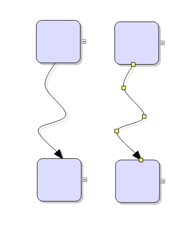
Diagramming for WPFNew PatternRouter class routes links by applying patterns of segment and turn sequences and accepting them when resulting paths do not cross nodes. A path is accepted if its final segment ends in target point and is orthogonal to respective side of target node. If there are several possible paths, the router selects the shortest one. The MinimumDistance property specifies minimum allowed distance of link segments from nodes. The PreferredDistance property specifies distance of first or last link bend from associated node. PatternRouter includes several predefined patterns designed to create consistent-looking paths, and allows creation of custom patterns. Custom patterns can be defined as sequence of RouteStep objects specifying whether the path advances by relative or absolute distance, or changes direction:
| C#
Copy Code
|
|---|
var rightZigzag = new RoutePattern(); |
The CompositeRouter class lets you chain link routers (objects implementing ILinkRouter interface) so that a link passes through the sequence until it gets routed successfully. Diagram's default router is now set to a CompositeRouter instance containing a PatternRouter and GridRouter sequence. This applies the several standard pattern paths when possible, and otherwise routes links using the cost minimizing heuristics-based grid router.
The MindFusion.WPF Pack distribution now includes assemblies and sample projects for .NET 6. Locally installed assemblies do not appear automatically in Visual Studio toolbox at this time; you can either add them manually or through Nuget package manager.
Diagramming for WPFThe NodeLabel class allows multiple captions to be displayed for a single DiagramNode of any type. Node labels provide a set of properties allowing full customization of their display and positioning. Label position is defined by specifying a pin point and offset from it, set through SetCornerPosition, SetEdgePosition, SetCenterPosition methods. In addition, the TextAlignment and TextVerticalAlignment properties of NodeLabel specify on which side of pin point to draw the label's caption.
For example, following code adds extra labels to top-left and bottom-right corners of a ShapeNode:
| C#
Copy Code
|
|---|
var node = diagram.Factory.CreateShapeNode(30, 70, 80, 60); |
Virtual Keyboard for WPF Spreadsheet for WPF Reporting for WPF Diagramming for WPFSet the Scrollable property of ContainerNode to let users scroll the container's contents. The node then displays scrollbars at right and bottom edges that can be used to scroll interactively. The ScrollX and ScrollY properties let you determine current scroll position or change it programmatically. Note that in order to let container's content overflow and become scrollable, you must either disable AutoGrow, or allow users reduce container size by changing HandlesStyle and EnabledHandles properties from their default MoveOnly / Move values.
Virtual Keyboard for WPFFixed unequal layout margins; now the keyboard should center correctly inside its layout area.
 Charting for WPF
Fixed segment clipping in linecharts for values outside of current vertical range.
Spreadsheet for WPF MindFusion.UI for WPF
Fix for DockControl activating wrong window when undocking items and application contains two top-level windows.
The MindFusion.WPF Pack distribution now includes assemblies for .NET 5. Locally installed assemblies do not appear automatically in Visual Studio toolbox at this time; you can either add them manually or through Nuget package manager.
Diagramming for WPFThe SvgNode class represents nodes that display SVG drawings, in addition to the rendering provided by the base ShapeNode class. A node's SVG drawing is rendered after its associated bitmap Image. Set the Transparent property of base type to hide the node's Shape geometry and draw only SVG graphics. The SVG drawing that should be shown inside an SvgNode is specified through the node's Content property. SVG graphics are loaded and associated with the node through an SvgContent object, which should be initialized and then assigned to this property.
The SvgImporter class allows importing Scalable Vector Graphics files (*.svg) into MindFusion.Diagramming. Each top-level SVG group element is imported as a separate SvgNode, whose Content is set to the group's child elements. If the SVG file was exported from Visio or OpenOffice Draw, SvgImporter will create DiagramLink objects for groups it recognizes as connectors in order to recreate the original diagram model, though in this case it will not preserve fully the original appearance of connectors in SVG.
BarcodeNode now supports barcodes in code 128 format.
The control now supports several ways to zoom using lasso tool:
The FishboneDiagram controls creates Ishikawa diagrams (a.k.a. fishbone or cause-and-effect diagrams) from specified data source. Fishbone diagrams are used to display causes of manufacturing effect / defect / event, grouped in categories, and arranged as ribs around a backbone. The FishboneDiagram control creates a category branch (rib) for each item specified in the ItemsSource property. Category labels are obtained from the items' property specified by LabelPath. The causes in a category are obtained from the collection-property of items specified via CausesPath. If the collection contains strings, they are displayed directly as labels in respective branch. If causes are data objects, their labels are obtained through CauseLabelPath.
Scheduling for WPFTwo dark themes added, accessible via the Dark and Black elements of ThemeType enumeration.
Dark | Black |
|---|---|
|
|
Reporting for WPFBarcode objects now support barcodes in code 128 format.
Virtual Keyboard for WPF Spreadsheet for WPF MindFusion.UI for WPF Diagramming for WPFArrangeAnimated methods added to Diagram and ContainerNode classes animate the movement of items from their original locations to new locations assigned by the layout object. This can be used to create an explode effect by starting new layout from overlapping nodes on same position, or an insertion effect by adding a new node to an existing layout.
Diagrams can now be serialized in JSON format. This can be used for interoperability with MindFusion JavaScript diagramming library, or for general storage in JSON files or databases. To serialize a Diagram to a JSON string, call its SaveToJson method. To deserialize a diagram back from its JSON representation, call the LoadFromJson method. Custom item classes can implement JSON serialization for their additional properties by overriding the SaveToJson and LoadFromJson methods of DiagramItem. Such classes must be registered for serialization by calling the RegisterItemClass method and providing a string identifier for the clientClass parameter.
DxfExporter exports diagrams to AutoDesk Drawing Exchange Format (DXF) files. In order to use this component, add a reference to the MindFusion.Diagramming.Wpf.DxfExport.dll assembly to the project. To create a DXF file from a diagram, create a DxfExporter instance and call its Export method, specifying a Diagram object and a file path as arguments.
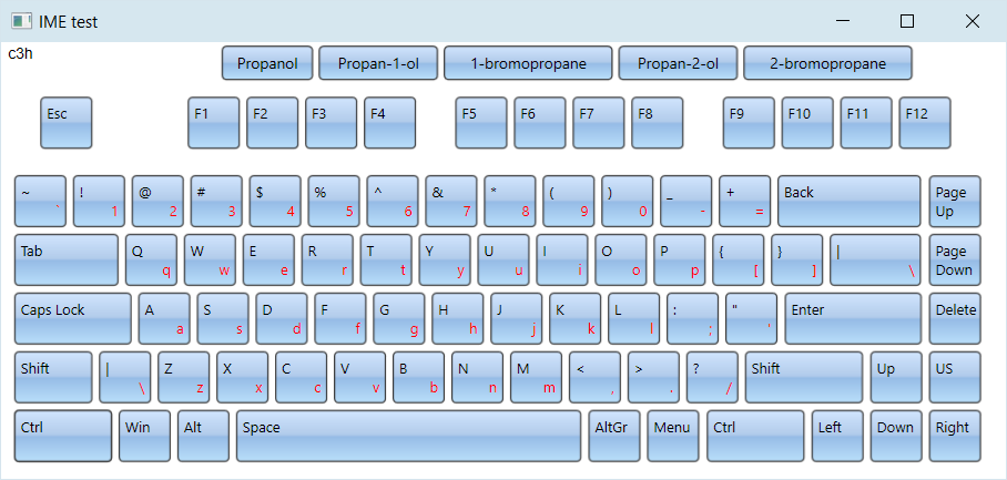
Spreadsheet for WPF MindFusion Virtual KeyboardThe component now supports general IME mode that maps raw input sequence to dictionary entries. The keyboard collects clicked characters in a staging area and shows the matching entries as suggestions. Users can either click a suggestion button to send its content as input, or click the space key to send the first suggestion.
To enable IME mode, call the LoadImeTable method, specifying the language for which to load IME table and the dictionary file path. The table file format contains one line per entry, with three tab delimited values: raw input, translation, frequency. For example, a hypothetical IME table that translates chemical formulas to compound's common name could look like this:
| C#
Copy Code
|
|---|
| c3h8o Propan-2-ol 2 c3h8o Propanol 4 h2o Water 1 c3h8o Methoxyethane 1 c3h8o Propan-1-ol 3 c2h6 Ethane 1 c3h7br 1-bromopropane 3 c3h7br 2-bromopropane 2 .... vk.LoadImeTable( new CultureInfo("en-US"), "chemical.txt"); |
and suggestions for the partial input "c3h" will look like this:
The component can parse IME tables from the Linux Ibus project to implement various Chinese transliteration systems. For example you can load following tables for respectively mainland China's simplified Chinese, Taiwan's traditional Chinese and Hong-Kong's Cangjie input methods:
Zhuyin
https://github.com/definite/ibus-table-chinese/blob/master/tables/zhuyin.txt
Cangjie
https://github.com/definite/ibus-table-chinese/blob/master/tables/cangjie/cangjie3.txt
The following image shows the Zhuyin input method: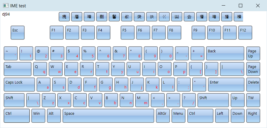
If current language is Japanese, the keyboard renders Hiragana characters. In addition, LoadImeTable can parse tables from Google's mozc project to convert Hiragana to Kanji. To enable this mode, specify path to a directory containing the 10 dictionary files from following link:
https://github.com/google/mozc/tree/master/src/data/dictionary_oss
This image demonstrates Hiragana to Kanji conversion:
The keyboard renders Hangul letters when current language is Korean, and automatically enables IME mode that converts letter sequences to Hangul syllabic blocks according to Unicode rules:
Note that the open source Chinese and Japanese dictionaries linked above have licensing terms of their own - some are in the public domain, some include attribution / no warranty clauses, some are LGPL. For licensing terms, check comments in respective dictionary files or license sections of their parent project. If there is enough interest, we will provide built-in dictionaries on MindFusion's standard licensing terms for next releases.
Scheduling for WPFSchedules can now be serialized in JSON format. This can be used for interoperability with MindFusion JavaScript scheduling library, or for general storage in JSON files or databases. To serialize a Schedule to a JSON string, call its SaveToJson method. To deserialize a schedule back from its JSON representation, call the LoadFromJson method. Custom item classes can implement JSON serialization for their additional properties by overriding the SaveTo(JsonObject) and LoadFrom(JsonObject) methods of base Item class. Such classes must be registered for serialization by calling the RegisterItemClass method and providing a string identifier for the clientClass parameter.
Charting for WPFSpecify custom grid line positions by setting GridType to Custom and assigning coordinates to XGridLines and YGridLines collections.
Diagramming for WPFAll graph layout classes now contain an async ArrangeAsync method that runs layout calculations in a background task. This is only available in .NET 4.5 build of the diagram assemblies.
| C#
Copy Code
|
|---|
async void OnLayoutLayered(object sender, RoutedEventArgs e) |
The ExcelExporter class from MindFusion.Diagramming.Wpf.ExcelExport.dll assembly exports diagrams to Excel Open XML Format (XLSX) files. Diagrams are exported as Excel AutoShapes drawings. The Export overload that takes a DiagramDocument parameter creates a sheet for each DiagramPage in the document. The Export(Diagram) overload creates a single Excel sheet.
Spreadsheet for WPFWorksheets now support autofiltering. To enable it, call the AutoFilter method of the CellRange class. To specify autofiltering criteria for individual columns, use the AutoFilter overload. These criteria can also be specified interactively, through the drop-down buttons inside the headers of each column in the target range.
The standard forms from the MindFusion.Spreadsheet.Wpf.StandardForms.dll assembly can now be localized for German, Spanish, French, Korean, Portuguese, Russian, and Chinese. To do this call the new SetLocalizationInfo method of the Workbook class and provide a XML file containing the localized strings for the respective language. The XML files for the above languages can be found in the Localization folder inside the component installation.
Rows and columns can now be grouped. To group or ungroup a range of rows or columns, use the Group or Ungroup methods of the RowRange and ColumnRange classes. To set the outline level of a row/column or a range of rows/columns directly, use the OutlineLevel property. Groups can be expanded and collapsed interactively, by clicking on the expand/collapse button in the view, or programmatically, by settings the IsCollapsed property of the respective row or column.
Several new events have been added to the WorkbookView class: ColumnGroupCollapsed, ColumnGroupExpanded, ColumnOutlineLevelToggled, RowGroupCollapsed, RowGroupExpanded, and RowOutlineLevelToggled.
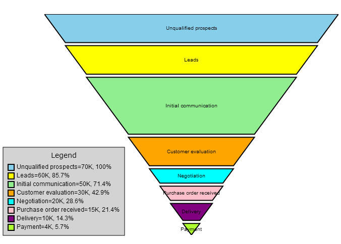
MindFusion Virtual Keyboard Charting for WPFFunnel charts are often used to represent the stages of a process and show relative values or measurements associated with each stage. In MindFusion.Charting API, funnel charts can be created using the FunnelChart control associated with a FunnelSeries providing data. FunnelChart inherits appearance properties from the base Chart class, and offers additional customization through StemWidth and SegmentPadding properties.
 Diagramming for WPF
The shape of a ShapeNode can be flipped horizontally or vertically. Enable the AllowFlip property and the shape flips when an edge is dragged over its opposite edge. You can get or set current flip state using FlipX and FlipY properties.
Extension methods in MindFusion.Diagramming.Wpf.Fluent and MindFusion.Diagramming.Wpf.Layout.Fluent namespaces let you initialize objects using fluent programming style:
| C#
Copy Code
|
|---|
using MindFusion.Diagramming.Wpf.Fluent; |
The ShapeListBox control displays a list of Shape icons along with their DisplayName. It lets users drag-and-drop a Shape to the diagram's canvas to create a new ShapeNode. Set the ItemsSource property to an array or collection of shapes that should be rendered inside the control. For example, setting the Shape.Shapes list as ItemsSource will show all pre-defined shapes. You can customize the shape appearance by setting ShapeBrush and ShapeSize properties.
 Scheduling for WPF
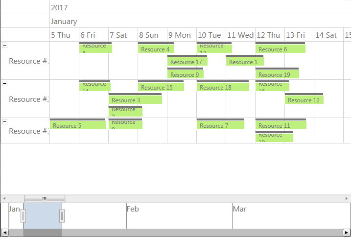
The Calendar control can integrate with the new RangeSelector component in order to implement a timeline in the Resource view. The new ResourceTimeline sample illustrates this integration.
 Spreadsheet for WPF
The ExcelExporter and ExcelImporter classes are now times faster than before and the results are more accurate. Various problems and inconsistencies were fixed. Both classes now expose a View property. If you set the View property of the ExcelExporter, the exporter will also export view information, such as the active tab and selection. Alternatively, setting this property during import, will cause the view information to be imported.
Charting for WPFThe CandlestickSeries class represents movements of stock or currency prices in financial charts. Individual values in the chart are specified via StockPrice objects assigned to the series' Values property. Candlestick bodies are filled using brushes from the Fills collection if ones are specified, or otherwise with the FallingPriceBrush and RisingPriceBrush depending on the difference between Open and Close prices. CandlestickSeries can be added to either LineChart or BarChart controls.
Virtual Keyboard for WPFVirtual Keyboard for WPF has been initially added to MindFusion.WPF Pack.
There is no separate trial build of the control assemblies anymore. Instead, set the LicenseKey property of the controls to disable their evaluation mode and stop displaying trial messages. If your application contains more than one control by MindFusion, you could call MindFusion.Licensing.LicenseManager.AddLicense(key) from application start-up code to specify the key once instead of setting it per each control. License key strings are now listed on the Keys & Downloads page at MindFusion's customer portal.
MindFusion.WPF Pack now includes support for Visual Studio 2015. The installer can create VS2015 toolbox palette for the component.
The new BarcodeLabel class allow displaying EAN, UPC or QR barcodes.
Charting for WPFSelected area with width smaller than MinZoomSpan does not evoke any action in the control. In addition, the new ZoomChanged event fires whenever zoom occurs and provides useful data for the zoom action with its ZoomChangedArgs.
The cross hair control has been improved with several new properties, a method and an event. The properties are:
The new CrosshairPosition method returns the current location of the cross hair. For more precise handling of cross hair movements a new event is available – CrosshairPositionChanged.
3D charts have received plenty of improvements, new properties and performance optimizations:
The SurfaceType enum has been replaced with three bool properties, which makes the API easier to understand and use.
ScatterFaceSize – the property regulates the size of the polygons that build a 3D scatter. Bigger values lead to bigger polygons, which results in faster performance and more rough scatter mesh.
Effect3D.ShaderEffect – the property can be applied to all 3D chart elements, including scatters and performs much faster.
Two new methods have been added for exporting the chart as an image – CreateImage and ExportImage.
A new property has been added to the RealTimeChart library – Axis.LabelFormatProvider. Use it to specify custom formatting of numeric labels. If required, you can specify format arguments for your format classes with Axis.LabelFormat.
Diagramming for WPFA FreeFormNode collects all points from users' mouse or touch input and displays them as node's outline. To let users draw free-form nodes interactively, set Diagram.Behavior to DrawFreeForms or LinkFreeforms. Use the Points property of FreeFormNode to get or set outline points programmatically. If the Closed property is set, the node is drawn as a closed shape and its interior filled, or otherwise the node is drawn as a poly-line. If the distance between first and last points drawn by user is shorter than Diagram.AutoCloseDistance, the node's Closed property is automatically set to true. AutoCloseDistance default value is Double.MaxValue, so free-form nodes are always closed.
Additional drawing modes, convenient for touch input, convert FreeFormNode objects drawn by user to ShapeNode objects with most similar shape. To enable them, set Behavior to DrawFreeShapes or LinkFreeShapes. The shapes against which the user's input is matched are set via diagram's FreeFormTargets property. By default it contains Rectangle, Decision and Ellipse shapes.
Shape formulas can now be parameterized by associating control points with Shape objects. Each control point is passed to the shape script as a named variable. Apart from the name, you can specify the default, min and max coordinates for each parameter via the ShapeControlPoint constructor, and whether to treat its values as percents or fixed offset.
Columns and rows of a TableNode can now be resized interactively if its AllowResizeColumns or AllowResizeRows properties are enabled. In order to resize, move the mouse pointer to the border line on column's right side or row's bottom side until it shows resize cursor and start dragging. The control raises TableColumnResizing and TableRowResizing events to let you validate new size or prevent resizing some elements. The TableColumnResized and TableRowResized events are raised after the operation completes.
The BarcodeNode class displays EAN, UPC or QR barcodes as node's content. In-place edit operations let users enter new numeric codes for 1D codes or text strings for QR codes. The barcode format is specified via the Format property, the encoded number or text is set via Content, and color of 1D bars / 2D modules via BarColor.
The diagram can now display shapes from stencil files in Visio 2003 XML stencil format (.vsx). To load a stencil file, use an instance of the VisioStencil class. The shapes are displayed in the diagram through VisioNode objects. To associate a stencil shape with the node, create an instance of the VisioContent class and assign it to the node's Content property. Note that standard stencils installed with Visio are copyrighted by Microsoft, and you should not use them in your application. This feature is intended to let you use public domain stencils, or commercial clipart you have purchased a license for.
 Mapping for WPF
The ZoomControl class lets user change interactively the current zoom level and scroll position of a MapView. To set it up, add a ZoomControl to the page, place it anywhere over a MapView, and set the control's Target property to that view. Set the ZoomStep and ScrollStep properties to specify the amount added to view's zoom level or scroll position by ZoomControl's buttons. You can customize the control's appearance by setting properties such as Fill, CornerRadius and TickPosition.
Reporting for WPFParameters can now be added to a report through the new Parameters collection of the Report class. The parameters provide name, description and value and can be of any type, including expression. For more information about parameters, check the Report Parameters topic.
Reporting for WPF reports can now display UPC-A, UPC-E, EAN-8, EAN-13, and QR barcodes. The barcodes are represented by the new Barcode report item.
Scheduling for WPFRecurrences can be rescheduled interactively by holding down the RescheduleRecurrenceKey while dragging a recurrent item. The control tries to preserve the current pattern of the recurrence when possible. Otherwise, the recurrence may be modified to accommodate to the new start and end times of the modified item. Interactive rescheduling is not registered in the undo history.
A new built-in theme is available in Scheduling for WPF – the Light theme. It is available through the ThemeType enumeration.
Several new properties and events have been added to the control:
Diagramming for WPFThe ShapeDesigner component implements a vector-drawing canvas where Shape definitions can be created interactively. Call the ImportShape method to open a shape for editing. Call the ExportShape method to create a Shape with specified Id from current content of the designer canvas. ShapeDesigner shows a palette with two kinds of elements: Primitives which when dropped on the canvas add a single curve or line segment, and Templates which when dropped on canvas add a closed path of several graphic primitives.
Tree maps represent hierarchies by nesting child nodes within their parents, where the areas of leaf nodes are proportional to their Weight values. Unlike other layout algorithms, TreeMapLayout expects hierarchies to be defined via grouping or containment (see AttachTo method and ContainerNode class), and will ignore any links in the diagram. The diagram area covered by the topmost nodes in a hierarchy is specified via the LayoutArea property. By default, the layout tries to keep the ratio of node sides as close as possible to one. However this could make it hard to distinguish separate levels of the hierarchy. To alleviate that, set Squarify to false, and child nodes will be arranged either as a row or a column inside their parent node, alternating directions for each level. The drawback is that when Weight ratios differ greatly or nodes contain many children, some nodes could end up with very narrow rectangles.
DecisionLayout arranges simple flowcharts consisting of decision boxes with up to three outgoing links per node and activity boxes with a single outgoing link per node. The nodes are arranged in columns and rows, whose distance depends on the HorizontalPadding and VerticalPadding property values. When links share the same row or column, they are placed at a distance specified via LinkPadding. The layout arranges nodes recursively starting from StartNode. If StartNode is not specified, the algorithm selects the root of the deepest branch of the graph's spanning tree as start node.
The Visio2013Exporter class can export the content of Diagram and DiagramDocument objects to Visio 2013 VSDX files. In order to use it, add a reference to the MindFusion.Diagramming.Wpf.VisioExport.dll assembly. Similarly to the VDX format exporter, Visio2013Exporter relies on a template file, called Visio2013.vxt, containing some boilerplate Visio XML code. The template must be either located in same folder as the application assemblies, or its path must be specified via the TemplatePath property. At this time the exporter supports shapes from Visio basic stencil.
The following properties have been converted to dependency properties:
Spreadsheet for WPFSpreadsheet for WPF has been initially added to MindFusion.WPF Pack.
Charting for WPFA brand new library has been added to the Charting for WPF component - a real time chart. The new control is specially optimized to render fast large amounts of data in real time. Its major feature is the ability to handle a lot of points without loading the machine it runs on. The library also offers various customization options for the chart - scatters, multiple legends, multiple Y and Y2 axes, custom labels, tooltips, grid. You can read more about the component in the "Real Time Chart" section in the "Programming Interface Overview" topic. We have added samples, tutorial and detailed documentation for the component in the Charting for WPF installation.
Scheduling for WPFThe cells and headers in the data grid can now be customized through a set of new properties: CellBorderBrush, CellBorderThickness, HeaderBackground, HeaderBorderBrush, HeaderBorderThickness, HeaderFontSize, HeaderForeground, and HeaderMargin. The new ColumnCreating event can be used to replace a grid column with a custom one.
Five new holiday providers have been added to the MindFusion.HolidayProviders.dll assembly, namely AustraliaHolidayProvider, FranceHolidayProvider, GermanyHolidayProvider, RussiaHolidayProvider, and UKHolidayProvider.
The WorkTimeStartHour and WorkTimeEndHour properties have been renamed to WorkTimeStart and WorkTimeEnd respectively and are now of type TimeSpan to allow more flexible work time intervals. In addition, the new WorkTimeStarts and WorkTimeEnds properties can be used to specify different work time intervals for the different days in the view. The new ColumnHeaderTemplate property can be used to customize the column headers by using a DataTemplate object.
The Week Range view can now display week numbers, similarly to the Single Month view. The week numbers can be enabled through the WeekHeaderPosition property and can be customized through the RotateWeekHeaderTexts, WeekHeaderFormat, WeekHeaderStyle, and WeekNumbersHeaderWidth properties.
The row headers can be customized through the new RowHeaderTemplate property.
Mapping for WPFThe ZoomControl class lets user change interactively the current zoom level and scroll position of a MapView. To set it up, add a ZoomControl to the page, place it anywhere over a MapView, and set the control's Target property to that view. Set the ZoomStep and ScrollStep properties to specify the amount added to view's zoom level or scroll position by ZoomControl's buttons. You can customize the control's appearance by setting properties such as Fill, CornerRadius and TickPosition.
Reporting for WPFSeveral new properties have been added to the LineChart class to imporive the customization for the plot, grid, legend and axes. The axes settings can be specified through the new XAxisSettings and YAxisSettings properties.
The AxesChart class exposes four new properties, which can be used to specify the intervals displayed by the chart axes. The new properties are XMinValue, XMaxValue, YMinValue, and YMaxValue.
MindFusion Pack for WPF now includes support for Visual Studio 2013. The installer can create VS2013 toolbox palette for the components, and can optionally install VS2013 sample projects.
Diagramming for WPFThe Visio2013Importer class can import .vsdx files, created by version 2013 of Microsoft Visio. In order to use it, you must add a reference to the MindFusion.Diagramming.Wpf.VisioImport.dll assembly. Various overloads of the Import method can be used to import the Visio drawing into a DiagramDocument whose pages correspond to the Visio pages, or into a single Diagram whose content is merged from all imported pages. When merging multiple pages, their positions in the diagram depend on the PagesPerRow value. Visio2013Importer supports Visio's basic flowchart and data flow stencils. For each node shape from the .vsdx file, the importer creates a ShapeNode object whose Shape, Text, Brush and Stroke properties are set to values corresponding to the imported Visio shape. For each connector shape, the importer creates a DiagramLink object whose Origin and Destination are set to the corresponding imported nodes, and whose ControlPoints reflect the geometry of the connector.
The MindFusion.UI.WpfZoomControl class lets the users to interactively change the current zoom level and scroll position of a Diagram or DiagramView. To set it up, add a MindFusion.UI.WpfZoomControl to the window, place it anywhere over the target diagram, and set the control's Target property to that diagram or view. Set the ZoomStep and ScrollStep properties to specify the amount added to view's zoom level or scroll position by MindFusion.UI.WpfZoomControl's buttons. You can customize the control's appearance by setting properties such as Fill, Stroke, CornerRadius and TickPosition.
Charting for WPFA new chart has been added - the bubble chart. The bubble chart is represented by the new BubbleChart class. Its data series are specified through instances of the BubbleSeries class. The visual elements inside the chart are represented by Bubble objects.
The 3D charts, such as BarChart3D and SurfaceChart, no longer derive (indirectly) from Chart. Instead, they share a new base class - Chart3D. This way the 2D and 3D class hierarchies are now parallel. Many of the properties of the old 3D chart classes have been promoted to the new Chart3D class. The hit-testing in 3D charts has also been improved. The Chart3D.HitTest method returns a ChartHitTestResult3D object, which contains information about the result of the hit-testing operation, in addition to the list of ChartElement objects available in the 2D version.
Several new properties have been added to the SurfaceChart, including CloseModelFigure, Effect3D, SurfaceType. The SurfaceType property now enables the surface chart to display its associated data as scatter marks, rather than a surface. The scatter marks can be customized through several new properties in the SurfaceSeries class, namely ScatterSize, ScatterType, and ShowScatterFlag.
New ChartEffect property has been added to the Chart class. Currently the only supported effect is Glass.
Diagramming for WPFThe DiagramView3D control lets you display the elements of a diagram in 3D space. Assign the Diagram that should be displayed in this view to the Diagram property. DiagramView3D adds a 3D model to the scene for each node or link of the specified diagram. The positions of nodes in 3D coordinate space are specified via the Position3D attached property. Links are rendered as straight lines connecting the 3D node models. By default, nodes always face the camera, unless NodeRotationType is set to None.
The DrawImporter class can import .odg files, created by the OpenOffice Draw vector graphics editor. In order to use it, you must add a reference to the MindFusion.Diagramming.Wpf.DrawImport.dll assembly. Various overloads of the Import method can be used to import the OpenOffice drawing into a DiagramDocument whose pages correspond to the Draw pages, or into a single Diagram whose content is merged from all imported pages. DrawImporter supports shapes from the General and Flowchart shape palettes in Draw. For each node shape from the .odg file, the importer creates a ShapeNode object whose Shape, Text, Brush and Stroke properties are set to values corresponding to the imported OpenOffice shape. For each connector shape, the importer creates a DiagramLink object whose Origin and Destination are set to the corresponding imported nodes, and whose ControlPoints reflect the geometry of the connector.
VisioImporter allows importing Visio 2003 XML Drawing files (*.vdx) into WpfDiagram. The standard Visio flowchart shapes, as well as most of the UML and Database entity shapes are imported to their closest representation in the MindFusion.Diagramming object model. The Visio connectors are imported as DiagramLink objects, preserving the relationship between the connected nodes. In addition, most of the attributes of Visio objects such as text, text formatting, fill and line colors and styles are preserved. The component raises an event for each imported node to let you set the node shape if it is not recognized by MindFusion.Diagramming or if you need to set a different shape.
The Import method imports all Visio pages into a DiagramDocument, creating a DiagramPage for each page from the VDX. To determine how many pages there are in a Visio document and import only a single page, call the GetPageCount and ImportPage methods. All pages of a Visio drawing can be imported into a single Diagram by calling the ImportAllPages method, which lays out the pages as set in PagesPerRow.
MindFusion.WPF Pack now includes support for Visual Studio 2012. The installer can create VS2012 toolbox palette for the components, and can optionally install VS2012 sample projects. In addition, toolbox palettes are now created for all .NET target frameworks supported by the respective Visual Studio versions.
Charting for WPFStyles define the appearance of a given chart element - the axis, the series, the legend. Each ChartTheme is a collection of styles. With Charting for WPF you can now:
The Working with Themes tutorial gives detailed information on how to create, save, load and edit themes with Charting for WPF.
Charting for WPF lets you now edit all collection properties, including the Series collection, the brushes and strokes in design time through the property grid.
The new AxisSettings.IntervalCount property lets you specify the exact number of intervals at the axis. In such case the control does not use the Interval property and calculates the value of each interval based on AxisSettings.Min, AxisSettings.Max and AxisSettings.IntervalCount.
 Important Note Important Note |
|---|
Due to the extended design time support that we added in this version all predefined data series and brush collections have been removed from the charts. This might lead to exceptions if you reference them. To correct this just create a new instance of the type you are trying to access in the collection. |
Diagramming for WPFThe Balance property of TreeLayout can be set to Preserve to keep the original geometric order of child nodes when arranging them under their parent. This can be used to arrange tree branches in a specific order by first positioning them in increasing horizontal or vertical positions. Another possibility is to apply TreeLayout from NodeModified handler to let users rearrange the tree branches by dragging and dropping a node.
Reporting for WPFNew exporters have been added - PdfExporter and MhtmlExporter, which enable exporting to the PDF and MHTML formats respectively. For more information about the new exporter, check Exporting Reports.
Items in the report can now be arranged parallelly by putting them inside the new SideBySideContainer report item. For example, this is useful to display two (or more) data ranges one next to the other.
Scheduling for WPFThe ItemPresenter class now provides the start and end time of the represented item fragment through the new StartTime and EndTime properties. In addition, derived classes can override the new OnStartTimeChanged, OnEndTimeChanged, and OnItemPropertyChanged methods to get notified when the StartTime or EndTime properties change or when any property of the underlying item changes.
The Recurrence class now exposes a new event - ValidateOccurrence, which can be used to validate and customize the occurrences of a recurrence pattern.
Charting for WPFA brand new type of charts has been added - the radar chart control. It supports:
Charting for WPF supports hit testing. Use the HitTest method, which returns a list of ChartElement objects that contain the specified point. Each chart element has properties that help you identify the data that it represents:
Each chart supports the System.Windows.Media.Effects.DropShadowEffect and System.Windows.Media.Effects.Blur effect. Use the Effect property to specicy the chosen effect.
Diagramming for WPFTwo visual effects, represented by GlassEffect and AeroEffect classes, can be applied to nodes. To apply an effect, create an instance of the respective class, set up its properties, then add the instance to the Effects collection of a node (or to Diagram.NodeEffects collection to apply it to all nodes). Effects can be added, removed or modified at any time and this will immediately reflect on the diagram. Effects of different types can be applied simultaneously. It is also possible to apply more than one effect of the same type.
The Brush, Stroke* and Font* dependency properties no longer contain initial local values and will inherit style values without having to clear the local values first. The diagram now exposes a style property for each built-in node type, which allows creating global styles for nodes directly in the diagram's markup code in the Xaml page. The properties are called ShapeNodeStyle, TableNodeStyle, etc. and are of the WPF's standard Style type.
A theme in WpfDiagram is a set of styles, each associated with specific item type. When the theme is applied to a diagram, the styles registered in the theme affect all objects of their associated type. Themes are represented by the Theme class and can be assigned to Diagram objects through their Theme property. Styles are associated with item types within the theme through the RegisterStyle method. The package now includes a Theme Editor tool that provides simple visual environment for theme creation and modification. There are also several predefined themes available in the Themes subfolder of the installation root folder. For more information about this new feature, check Styles and Themes.
The DiagramDocument class represents a collection of diagram pages or sheets, represented by DiagramPage objects. DiagramPage is derived from Diagram and only adds a Title property, so any current code that processes Diagram objects will work with DiagramPage objects too. New pages can be added to the document and existing pages can be removed and reordered via the Pages collection. The diagram document provides higher level of events for the pages contained inside it. The document supports the notion of an active page.
The new TabbedDiagramView can be used to display DiagramDocument objects. The view displays tabs for the individual pages in the document. The active page can be changed interactively by activating its associated tab. New pages can be added and removed to/from the document through buttons in the tab tray and the pages can be rearranged by dragging their associated tabs with the mouse.
The OneWayLayout class ensures that links enter into nodes from the same general direction and exit them from the opposite side. If the graph contains cycles, some links bend around the nodes to keep the enter/exit direction consistent. The algorithm aims to minimize the number of such links.
The LinkLabel class allows multiple captions to be displayed for a single DiagramLink object. Link labels provide a set of properties allowing full customization of their display and positioning. Labels can also be arranged automatically to avoid overlapping nodes and other labels by setting LinkLabel.AutoArrange to true.
Items can now be assigned to layers, and layers can be hidden, locked or moved up/down in the Z order as a group. Set the LayerIndex property of items to associate them with layers in the Diagram.Layers collection. The Layer objects provide Visible, Locked and ZIndex properties, which will affect all items in the respective layer. Layers also expose a Title property shown in the LayerListView control. Newly drawn items are added to the layer specified via Diagram.ActiveLayer. For additional information about layers, refer to Layers.
The LayerListView control provides user interface for working with Layer objects. The control displays a list of all layers in a specified Diagram with a title and an overview area, and also allows editing of layer's Title, Visible and Locked properties and choosing the Diagram's currently active layer. New layers can be added to the Diagram by clicking the '+' button. The selected layer can be deleted by clicking the '-' button.
The .NET 4 version of Diagramming for WPF takes advantage of the Task Parallel Library (TPL) to enable parallelism on the different layout algorithms. Set the EnableParallelism property on the Layout class to true to enable arranging different subgraphs on different threads to possibly improve performance on multiprocessor systems. In addition, the maximum degree of concurrency can be manipulated through the MaxDegreeOfParallelism property. Note that only independent subgraphs are processed in parallel, so the SplitGraph property of layout classes that provide it must also be set.
The new magnifier tool allows users to interactively zoom in (or out) portions of the diagram by holding down a modifier key or pressing a mouse button. The magnifier's zoom factor and appearance can be customized. Additional information can be found in the corresponding section of Scrolling and Zooming.
Charting for WPFNew type of charts has been added to the Charting for WPF control. It supports:
The new chart is represented by the SurfaceChart class. The tutorial Building a Surface Chart offers step-by-step instructions on how to adjust a surface chart according to your needs.
Users can drag data points in line charts or the top of a bar in bar charts to change the data value. This is done by setting the Behavior property to Behavior.AllowXDrag or Behavior.AllowYDrag. The Behavior enumeration now allows bitwise combination and you can enable dragging along both X and Y axis.
The X2AxisSettings allows you to define a second X-axis. Data for series that are bound to X2 is set with X2Data. X2Labels sets custom labels for the X2-axis. Data binding is available through the X2DataPath and X2LabelPath properties.
Zooming is now supported in all types of bar and line charts - just set the Behavior property to Behavior.ZoomChart. You can zoom out the chart one step at a time by calling ZoomOut. Use ResetZoom to restore the chart to its original state at once.
You can set the XData, YData or Y2Data of the LineSeries or BarSeries instances to DateTime values. Set the ValueFormat property of the respective AxisSettings object to ValueFormat.DateTime and specify appropriate DateTime values as start and end of the axis. You can find details on how to use DateTime values with the control in the DateTime Values section of this reference.
Diagramming for WPFVirtualizingDiagram can display very large diagrams where there are actual DiagramNode and DiagramLink instances created only for the elements that should be currently shown on screen. This helps keeping the WPF visual tree small and could lead to huge performance improvements if there are thousands of elements in the diagram.
The data items that should be displayed as nodes must be assigned to the NodesSource property, and the data items that should be displayed as links must be assigned to the LinksSource property. The BindingMode property specifies whether the data source should be updated when the user draws new diagram items interactively.
If AutoAlignNodes is enabled, the node currently being drawn or resized is aligned to another node so that a pair of their vertical or horizontal sides become collinear. To specify the maximal distance at which nodes are aligned, set the AutoAlignDistance property. The pair of aligned nodes is indicated visually by drawing an alignment guide using the pen assigned to AlignmentGuidePen.
FractalLayout is a tree layout algorithm that places child nodes symmetrically around their parent node. Nodes at the lowest level are arranged directly in a circle around their parent. At the upper level, the already arranged nodes form branches that are arranged in a circle around the new parent node. The algorithm is recursively repeated till the highest level is reached. If nodes in the tree have uniform number of children, the end result has fractal-like appearance (subsets of the graph look like scaled-down copies of the whole graph).
You can choose which node should be displayed at the center of the topmost circle by setting the Root property. If it is not specified, the algorithm automatically selects a root that leads to more balanced distribution of nodes.
Mapping for WPFMapping for WPF has been initially added to MindFusion.WPF Pack.
Scheduling for WPFThe Calendar control now support virtualization and is able to handle hundreds of items. The virtualization cannot be turned off. When using custom item or cell presenters, you need to pay special attention to the fact that those presenters can be subsequently reused by the virtualization engine for other items or cells. When a CellPresenter is reused, its StartTime and EndTime properties are updated to reflect the start and end time of the new cell. This causes the OnStartTimeChanged and OnEndTimeChanged methods to be invoked. When an ItemPresenter is reused its Item property is updated and its OnItemChanged method is invoked.
Delayed scrolling can now be enabled through the new DelayScroll property. When scrolling is delayed calendar views do not update immediatelly during scrollbar interactions. Instead the control displays a small tooltip with information about the new scroll position. The contents of the tooltip can be a date or an index, depending on the specific view and the scrollbar being modified. When the scrollbar interaction is complete, the view updates to reflect the new scroll position.
The new KeepItemOrder property can be used to prioritize the newly created items during collision processing.
 DataViews for WPF
Various improvements to the DataViews for WPF components, including the ability to programmatically drill in and out of views as well as scroll to a particular activity or resource.
Diagramming for WPFShape instances can be defined using custom code that takes into consideration the current width and height of nodes. This allows creating shapes whose primitive elements change non-uniformly, e.g. by growing only in width or height when a node is resized. There are two ways to create such shapes. The first one is to use the Shape constructor that takes a CreatePathDelegate parameter, which can be implemented using a .NET function. Another Shape constructor takes a string argument that represents a Visio-like shape formula evaluated in run-time. The latter method enables serializing the shape code in external files, which can be reused by different applications and by MindFusion components for other platforms.
CompositeLayout partitions the diagram into several subgraphs and applies the algorithm specified via the SubgraphLayout property on each part. If the part is a tree, it is arranged using the algorithm specified via the SubtreeLayout property, which is set to a radial TreeLayout instance by default. Finally the algorithm specified via MasterLayout is applied on the graph that represents the overall partition. By running the polynomial-complexity layout algorithms on small subgraphs, CompositeLayout is able to process a large graph much faster than if a layout algorithm is applied on the whole graph.
CompositeLayout can run on custom partitions specified as lists of nodes, or automatically partition the diagram via two automatic methods based on graph connectivity and graph path lengths. Set the PartitionMethod and CustomPartition properties to specify how the diagram should be partitioned.
Reporting for WPFA new exporter has been added - ExcelExporter, which enables exporting reports to the Open Office XML format. In addition, the APIs of all exporters have been unified. For more information about the new exporter, check Exporting Reports.
Scheduling for WPFNew exporter has been added - ExcelExporter, which enables exporting calendars to the Open Office XML format.
Many Calendar properties have been changed to dependency properties. These include Schedule, Date, EndDate, and more.
MindFusion.UI for WPFMany new controls, including DockControl, TabControl, Slider, Rating, ColorPicker and more.
DataViews for WPFA completely new assembly has been added to MindFusion.WPF Pack - MindFusion.DataViews.Wpf. The assembly contains two new controls - ActivityChart and ResourceChart. The Activity Chart and Resource Chart secions in this documentation discuss those controls in more details.
Charting for WPFCharting for WPF has been initially added to MindFusion.WPF Pack.
Diagramming for WPFSwimlaneLayout can be used to arrange process diagrams in which nodes representing activities are placed in swimlanes representing resources. The index of the resource allocated to an activity should be assigned to the corresponding node's LayoutTraits[SwimlaneLayoutTraits.Lane].
By default, the algorithm works with the diagram's LaneGrid, but its SwimlaneGrid property can be set to any class that implements ISwimlaneGrid. This allows applying the layout to a custom-drawn grid rendered through a custom control template, or one composed of locked background nodes.
CascadeLayout places nodes on a virtual grid and arranges links orthogonally, such that if the source graph is planar all links are guaranteed to have no more than two bends and will not intersect. By default the layout method arranges nodes in rows and link segments in columns; this can be changed by setting the Orientation property.
TriangularLayout places nodes on a virtual grid, such that if the source graph is planar, all links are guaranteed to have a single segment and not intersect. If the graph is not planar, its intersecting links can be optionally segmented and bended in order to improve readability. The layout method places the nodes from the external face on a triangle and recursively adds the rest of the nodes as vertices of internal triangles. As a result, it is very effective for near maximal-planar (a.k.a. triangular) graphs.
HierarchicalLayout places nodes on user-defined levels, such that if the source graph is level-planar, all links are guaranteed to have a single segment and not intersect. The layout method requires that for each node LayoutTraits contains a HierarchicalLayoutTraits.Level entry specifying the level, and no two connected nodes must be on the same level.
Scheduling for WPFThe implementations of the new IHolidayProvider interface can now be used to supply culture-specific lists of holidays. The USHolidayProvider can be used to supply the major holidays in United States for a specific time interval.
Reporting for WPFThe PieChart has been improved with new properties allowing additional customizations. There are also new BarChart and LineChart report items. For more information about the new report items, refer to their respective topics.
MindFusion.UI for WPFMindFusion.UI for WPF has been initially added to MindFusion.WPF Pack.
Diagramming for WPFThe TemplatedNode class represents nodes whose appearance is set through Xaml data templates. This class is useful mostly as a base type of custom nodes, as shown in tutorials 3 and 4. However it is not abstract and can be used directly if the text -related properties defined in DiagramItem are sufficient for your purposes. The appearance of such nodes can be set through their Template property or the NodeTemplate property of the Diagram class.
The WmfExporter class creates a Windows Metafile (WMF) drawing from the content of a Diagram. The exporter enumerates all graphics primitives contained in the WPF visual tree and creates corresponding WMF records. This enables custom graphics and hosted controls to be rendered in WMF too. To use WmfExporter, add a reference to the MindFusion.Diagramming.Wpf.WmfExport.dll assembly to your project.
Scheduling for WPFIf the UndoEnabled property is set to true, Scheduling for WPF tracks changes done on the schedule and allows undoing and redoing them later by calling the Undo and Redo methods of the Schedule class respectively. Multiple changes could be recorded as a single undoable operation by enclosing them between StartCompositeOperation and CommitCompositeOperation calls. It is also possible to create custom undoable operations by deriving from the Command class and calling ExecuteCommand with the custom command as argument.
 Gauges for WPF Reporting for WPF
Item appearance can now be modified or completely replaced through the use of the new Prerender event of the Report class. For more information, refer to Custom Rendering of Report Elements.
Gauges for WPFGauges for WPF has been added to MindFusion.WPF Pack.
Diagramming for WPFDiagrams can now be exported to SVG (Scalable Vector Graphics) drawings using the new SvgExporter class.
Enabled styling of diagram items through the WPF styling system.
Reporting for WPFReporting for WPF has been initially added to MindFusion.WPF Pack.
Diagramming for WPFThe Font property of diagram nodes, table cells and treeview items is deprecated. The DiagramItem class now exposes FontFamily, FontSize, FontStretch, FontStyle, FontWeight and TextDecorations dependency properties. This enables better support for the WPF animation and styling features. The Cell and TreeViewItem classes now derive from a common TextPresenter class that provides the same font properties as DiagramItem.
The TextFormat and CaptionFormat properties are now deprecated. They have been replaced by the TextAlignment, TextVerticalAlignment, TextWrapping and TextTrimming properties defined in DiagramItem. In addition, there is a new TextPadding property that specifies the padding of text within the text's bounding rectangle. The same properties are exposed by TextPresenter - the new base class of the Cell and TreeViewItem classes.
The Pen property of DiagramItem is deprecated. It has been replaced by Stroke, StrokeThickness, StrokeDashStyle, StrokeDashCap, StrokeStartLineCap, StrokeEndLineCap, StrokeLineJoin and StrokeMiterLimit. This enables better support for the WPF animation and styling features.
Scheduling for WPFThe cells in the various views can now be customized through WPF control templates. This is achieved through the new CellPresenter class. For an example on how to do this take a look at the two new samples - CustomResourceCells and Holidays.