


Tab Control with Page Templates
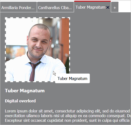
This tutorial will show you how to build a TabControl which renders tab pages whose layout is based on an HTML template. The screenshot below presents you the final application:
You must load the following JavaScript files used by the UI controls:
HTML
 Copy Code Copy Code
|
|---|
<script src="drawing.js" type="text/javascript"></script> |
We will use the Tahoma font for ther wab page and box-sizing for the <div> element that will represent the TabControl. We place the CSS code for this also in the <HEAD> section:
| CSS
Copy Code
|
|---|
<style type="text/css"> |
The next step is to initialize the <DIV> element that will represent the TabControl. We do this in the <BODY> part of the web page:
| HTML
Copy Code
|
|---|
<div style="position: absolute; top: 0; left: 0; right: 0; bottom: 0;"> |
The template that will be used for each TabPage is an HTML page with the following code:
| HTML
Copy Code
|
|---|
<!DOCTYPE html> |
We save the page as page.html.
We create an array with data to be used by the TabControl. This is an array that assigns values to the image, name and title keys that correspond to the id-s of the HTML elements in the template page:
| JavaScript
Copy Code
|
|---|
var d = MindFusion.Drawing; // Create some data for the tab pages. |
We create the TabControl using a reference to the "host" <DIV> that we have initialized above. We set its size using the Unit class and set its styling theme to "standard":
| JavaScript
Copy Code
|
|---|
// Create a new TabControl. |
We create the TabPage-s as instances of the TabPage class and set its templateUrl property to the HTML page that we've created. Then we add the new tabl to the collection of tabs of the TabControl:
| JavaScript
Copy Code
|
|---|
// Create two templated tab pages and add them to the host's tabs collection. |
We want to be able to add tabs dynamically - for example by adding a "+" sign after the tabs. When the user clicks on this sign a new TabPage will appear. The "+" sign is another TabPage for which we disable interactivity and selection:
| JavaScript
Copy Code
|
|---|
// Create a non-interactive tab to use as an "add tab" button. |
| JavaScript
Copy Code
|
|---|
// Render the host control. |
The first event we handle is the tabHeaderClick event of the TabControl.
| JavaScript
Copy Code
|
|---|
host.tabHeaderClick.addEventListener(handleTabHeaderClick); |
In the event handler method we will check if the header of the "+" tab page was clicked and if yes - we insert a new TabPage right before the "+" tab. The event handler method receives two arguments - one is the sender and the other an instance of the ItemEventArgs class that provides data or the event. The sender is the TabPage that was clicked:
| JavaScript
Copy Code
|
|---|
// This is the handler function of the tabControl.tabHeaderClick click. |
| JavaScript
Copy Code
|
|---|
// This is the handler function of the tabs contentLoad event. // Change the title of the tab's header. |
We use the ToolTip control to render a tooltip that follows the mouse whenever the user hovers the image in the TabPage. We bind the tooltip to the image element and we take its text from the "name" key in the data array. Finally we render the tooltip:
|
Copy Code
|
|---|
// Create a tooltip for the image element. |