


Represents a container of elements. The elements in the Accordion can be expanded or collapsed.
Namespace: MindFusion.UI.Wpf
Assembly: MindFusion.UI.Wpf
 Syntax
C#
 Copy Code Copy Code
|
|---|
public class Accordion : ItemsControl |
| Visual Basic
Copy Code
|
|---|
Public Class Accordion |
RemarksAccordion is an ItemsControl, which means it can contain a collection of objects of any type (such as string, image, or panel). The items in the Accordion control can be expanded and collapsed. The AllowMultipleExpands property determines whether more than one item can be expanded at a time. The items in the Accordion control can display a header. To associate a header with an accordion item, use the Header attached property of the Accordion class.
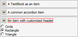
ExampleThe following code illustrates an Accordion control defined in XAML:
| XAML
Copy Code
|
|---|
<ui:Accordion> |
The image below displays the result:
 Inheritance Hierarchy
System.Object
System.Windows.Threading.DispatcherObject
System.Windows.DependencyObject
System.Windows.Media.Visual
System.Windows.UIElement
System.Windows.FrameworkElement
System.Windows.Controls.Control
System.Windows.Controls.ItemsControl
MindFusion.UI.Wpf.Accordion
See Also