


Standard Component Types

The following image illustrates the standard components using the default appearance settings. Additional information about the individual components can be found below.
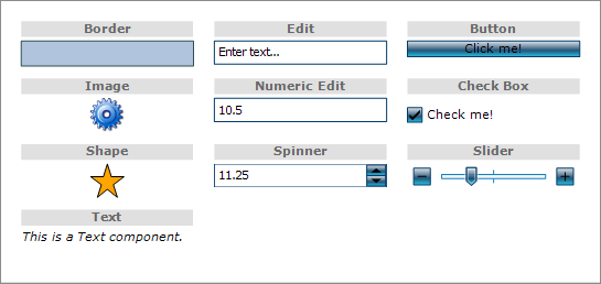
The border components can adorn a single component with a border and a background. To nest a more complicated structure within a border, use one of the panel components as a parent. The border component exposes few properties. The Background and Pen can be used to define the border appearance. The derived Padding property can be used to specify the distance between the border sides and the child component. The border child can be assigned through the Content property.
The button components represent a clickable button. The button components, similar to the border components, can host a single child component - usually a TextComponent. The default button appearance is controlled through a set of brush and pen properties - Brush, BrushHovered, BrushPressed, Pen, PenHovered and PenPressed. These properties define the appearance of the button in its different states. An alternative way to define the button appearance is through images by using the ImageList property. In addition the buttons can be custom drawn by handling the CustomDraw event. When a button component is clicked, the Clicked event is raised.
The check box components represent specialized buttons with an additional state - checked. The appearance of the check box in its checked state can be customized through the CheckedImageList. The state can be programmatically get or set through the IsChecked property.
Text components can display static text. Text components expose an array of properties for customizing the appearance of the displayed text, including Font, TextColor, TextAlignment, LineAlignment and Background. The text of the text components can be specified through the Text property.
The image components display an image in different alignment modes. The image and alignment can be specified through the Image and ImageAlign properties respectively.
The shape components can display arbitrary geometrical shapes. Any shape defined through a Shape object can be used, including all predefined shapes. The shape components can also be initialized using the specialized geometry syntax when defined in XML. For more information regarding this, check Components and XML. The appearance of the displayed shape is specified through the Brush and Pen properties and the shape itself is assigned through the Shape property.
The slider components provide a way to interactively select a single numeric value or a range of numeric values from within a fixed interval, by dragging one or more thumbs along a horizontal rail. In addition the slider component provides two buttons which can be used to adjust the value more precisely. The type of the slider component can be specified through the Type property. The interval of available values can be set through the Minimum and Maximum properties. The selected values can be get or set through the Value, StartValue and EndValue properties respectively depending on the type of the slider. The components expose a set of events, which are raised when the slider values are changed interactively. These events are BatchValueChanged, EndValueChanged, StartValueChanged, and ValueChanged.
The most basic of all three built-in panels. Simple panels arrange their child components on top of each other, in the order they were added in the Components collection. The children are positioned within the available space according to their HorizontalAlignment, VerticalAlignment, Width and Height.
Stack panels arrange their children in a vertical or horizontal row, according to the value of the Orientation property.
Grid panels arrange their children in a table. The rows and columns of this table are defined through GridRow and GridColumn objects which are added to the Rows and Columns collection of the GridPanel respectively. Each grid panel needs to define at least one column and row in order to be effective. The destination row and column of individual child components depends on the value of their GridRow and GridColumn properties.